Master Data Interpretation UGC NET with this complete guide covering essential formulas, calculation shortcuts, graph-type strategies, and a 15-day preparation plan for guaranteed marks.
If you’re a humanities, law, or arts student preparing for UGC NET, chances are Data Interpretation feels like the one section you’d rather avoid. You’re not alone in this. Most non-math background aspirants treat Unit 7 as their weakest link, when in reality, it’s one of the most predictable and scoring sections in Paper 1. With 5 questions worth 10 marks and no negative marking, this is your opportunity to secure guaranteed marks with the right preparation strategy.
This guide is designed specifically for aspirants who don’t come from quantitative backgrounds. You’ll find the exact formulas that appear in UGC NET, calculation shortcuts that cut your solving time in half, graph-type specific strategies based on previous year patterns, and a focused 15-day preparation plan. Everything here is based on analysis of questions from 2019 to 2025, so you’re learning what actually gets tested, not generic DI theory.
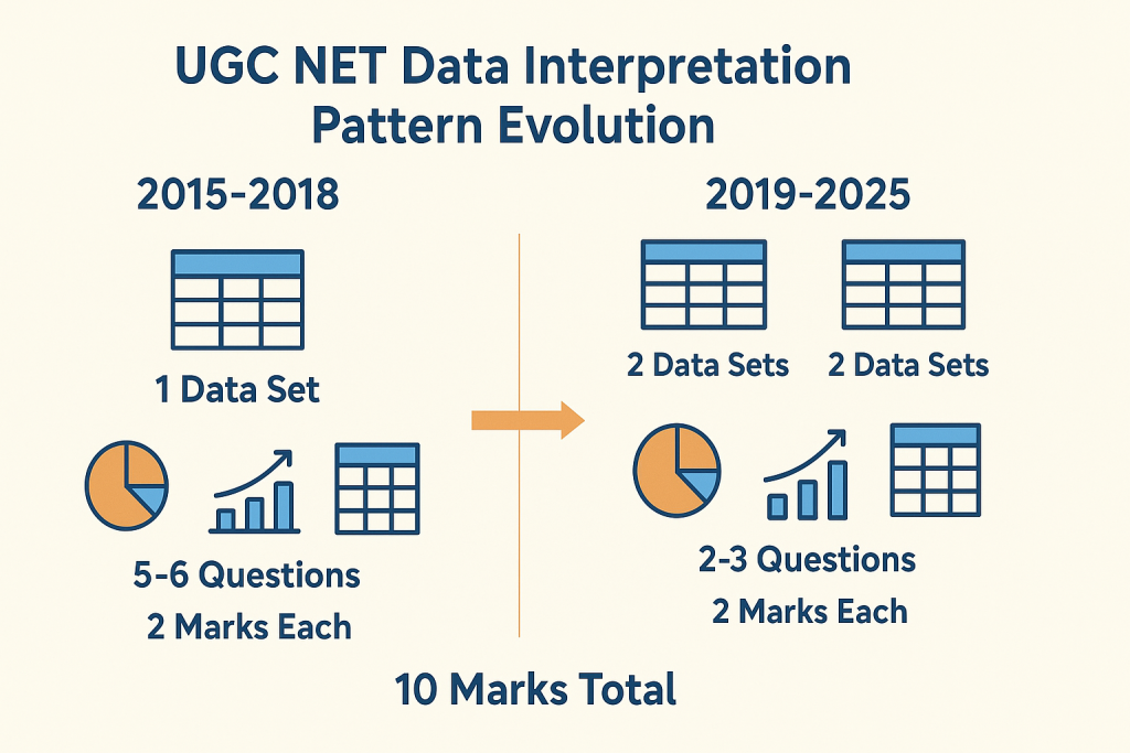
After analysing the exam pattern and question papers on UGC NET Paper 1, I have found that questions on data interpretation typically come from tables and pie charts, require basic percentage and ratio calculations, and can be solved in 2-3 minutes each with proper technique. The recent trend shows NTA presenting two data sets with 2-3 questions each, rather than the older pattern of one data set with 5-6 questions. Understanding these patterns gives you a strategic advantage before you even start solving.

Before diving into formulas and shortcuts, you need clarity on what NTA actually tests from this unit. The official syllabus for Unit 7 covers data sources, acquisition, classification, graphical representation, and data governance. However, analysis of previous year papers reveals that NTA focuses heavily on specific graph types and calculation patterns. Knowing where to invest your preparation time is half the battle won.
Syllabus of Data Interpretation
The official UGC NET Paper 1 syllabus lists Unit 7 as “Data Interpretation” covering sources, acquisition, and classification of data, quantitative and qualitative data, graphical representation including bar charts, histograms, pie charts, table charts, and line charts, mapping of data, data interpretation techniques, and data governance. While this sounds extensive, the actual exam questions concentrate on a much narrower range of topics. Your preparation should reflect this reality.
High-Weightage Topics (Tables and Pie Charts)
Tables dominate UGC NET Data Interpretation questions. These typically present company data, population statistics, production figures, or expenditure breakdowns across multiple years. The questions test your ability to calculate totals, averages, percentages, and ratios from the given data.
Pie charts are the second most frequent graph type, appearing in roughly 25-30% of questions. NTA typically presents pie charts showing percentage distribution of employees across departments, budget allocation across sectors, or resource distribution. Questions ask you to find actual values from percentages, compare sectors, or calculate differences between categories. Mastering these two graph types alone can help you secure 7-8 marks out of 10.
Low-Weightage Topics (Bar Charts and Line Graphs)
Bar charts appear less frequently but still require preparation. When they do appear, questions typically involve comparing values across years, calculating growth rates, or finding the difference between categories. Single bar charts are more common than grouped or stacked bar charts. The calculations remain straightforward, focusing on percentage change and ratio comparisons.
Line graphs are the least common graph type in the UGC NET DI section. When present, they usually show trends over time, such as temperature variations, sales growth, or population changes. Questions focus on identifying the year with maximum or minimum values, calculating growth rates between specific periods, or comparing trends across multiple lines. Don’t skip these entirely, but allocate less preparation time compared to tables and pie charts.
NTA primarily tests three skills through Data Interpretation: your ability to read and extract correct data from visual representations, your calculation accuracy with percentages, ratios, and averages, and your time management under pressure. The questions don’t require advanced mathematics. If you’re comfortable with class 10 level arithmetic, you have all the mathematical knowledge needed. What separates successful candidates is their speed and accuracy, not complex problem-solving abilities.
Previous Year Questions Analysis (2019-2025)
Understanding how NTA structures DI questions gives you a template for practice. The exam pattern has evolved over the years, and recent papers show a clear shift in how questions are presented. Analyzing this pattern helps you prepare for what you’ll actually face on exam day.
Single Data Set with 5 Questions Pattern
Until 2018, NTA predominantly used a single data set pattern where one table, pie chart, or bar graph was followed by 5-6 questions. This format appeared in December 2015, June 2015, December 2014, and earlier papers. Questions progressed from simple data extraction to more complex calculations involving multiple operations. If you’re practicing with older previous year papers, you’ll encounter this pattern frequently.
Two Data Sets with 2-3 Questions Each Pattern
From 2019 onwards, NTA shifted to presenting two separate data sets, each with 2-3 questions. The June 2020 paper featured questions based on renewable energy data and employee distribution across departments. December 2019 combined tabular data with bar charts. This pattern is slightly more challenging because you need to context-switch between different data sets during the exam. Your practice should reflect this current pattern.
Marks Distribution and Difficulty Level
Each DI question carries 2 marks, totaling 10 marks for the section. The difficulty level ranges from moderate to high, but rarely involves complex calculations. With no negative marking, attempting all five questions is always the right strategy, even if you need to make educated guesses on one or two.
Essential Formulas for UGC NET Paper 1 Data Interpretation
Data Interpretation in UGC NET doesn’t require you to know hundreds of formulas. In fact, most questions can be solved using fewer than 15 core formulas related to percentages, ratios, and averages. The key is knowing these formulas so well that applying them becomes automatic. This section gives you every formula you need, organized by category, with clear explanations of when to use each one.
Percentage questions in UGC NET Paper 1
Percentage questions form the backbone of UGC NET Data Interpretation. Based on previous year analysis, approximately 70% of all DI questions involve some form of percentage calculation. Whether you’re finding what percentage one value is of another, calculating percentage increase or decrease, or dealing with successive percentage changes, these formulas are non-negotiable. Master them before moving to any other topic.
Basic Percentage Calculation
To calculate % of y, use the formula: (p/100) × y. For example, 25% of 400 equals (25/100) × 400 = 100. To find what percentage y is of x, use: (y/x) × 100. For instance, if 150 students passed out of 600, the pass percentage is (150/600) × 100 = 25%. These two calculations appear in almost every DI question set, so practice them until they become second nature.
Percentage Increase and Decrease
Percentage change is calculated as: [(New Value – Old Value) / Old Value] × 100. If a company’s profit increased from 50 lakhs to 65 lakhs, the percentage increase is [(65-50)/50] × 100 = 30%. For decrease, the formula remains the same, but you’ll get a negative result. Remember that percentage change is always calculated with respect to the original or old value, not the new value. This is a common source of errors.
Successive Percentage Change Formula
When a value changes by a% and then by b%, the effective percentage change is: a + b + (ab/100). This formula saves significant calculation time. If a price increases by 20% and then decreases by 10%, the net change is 20 + (-10) + (20 × -10)/100 = 20 – 10 – 2 = 8% increase. Without this formula, you’d need to calculate the intermediate value, which takes longer under exam pressure.
Ratio and Proportion Formulas
Ratio questions appear frequently in UGC NET, often combined with percentage calculations. You might be asked to find the ratio of employees in two departments, compare expenditure ratios across years, or convert given ratios into actual values. The formulas here are simpler than percentages, but the application can be tricky. Focus on understanding when to apply each formula.
Ratio to Percentage Conversion
To convert a ratio to percentage, first find the total parts, then express each part as a percentage of the total. If the ratio of A to B is 3:2, the total parts equal 5. A’s percentage is (3/5) × 100 = 60%, and B’s percentage is (2/5) × 100 = 40%. This conversion is essential for pie chart questions where data is given in ratios but questions ask for percentage comparisons.
Comparing Two Ratios
To compare ratios, convert them to the same base or to decimals. The ratio 3:4 equals 0.75, while 5:7 equals approximately 0.71. Since 0.75 > 0.71, the first ratio is larger. Alternatively, cross-multiply: for comparing a:b with c:d, if a×d > b×c, then a:b > c:d. This technique helps when questions ask which year had a better ratio of profit to expenditure or similar comparisons.
A useful shortcut: if you need to find if A is x% more than B, remember that B is [100x/(100+x)]% less than A. For example, if A is 25% more than B, then B is [100×25/(100+25)]% = 20% less than A. This reverse percentage relationship appears in tricky questions designed to test conceptual clarity.
Average and Growth Rate Formulas
Average calculations are straightforward but frequently tested. Growth rate questions appear especially with line graphs and year-wise data tables. These formulas complete your essential toolkit for tackling any DI question in UGC NET.
Simple and Weighted Average
Simple average equals the sum of all values divided by the number of values. If company profits over five years were 10, 15, 12, 18, and 20 lakhs, the average is (10+15+12+18+20)/5 = 15 lakhs. This calculation appears in almost every table-based question set, often asking for average expenditure, average production, or average growth over a period.
Weighted average is used when different values have different importance or weights. The formula is: (Value1 × Weight1 + Value2 × Weight2 + …) / (Total Weights). If 30 students scored 60% and 20 students scored 80%, the weighted average is (30×60 + 20×80)/(30+20) = (1800+1600)/50 = 68%. Weighted average questions are less common but do appear, particularly in employee salary or production efficiency contexts.
Annual Growth Rate Calculation
For year-over-year growth rate, use: [(Current Year – Previous Year) / Previous Year] × 100. For compound annual growth rate (CAGR) over multiple years, the formula is: [(Final Value/Initial Value)^(1/n) – 1] × 100, where n is the number of years. However, CAGR calculations are rare in UGC NET. Most questions ask for simple annual growth rates or average growth rates, which is just the sum of individual growth rates divided by the number of periods.
Quick Reference Formula Table
Here is a reference table that will surely come in handy:
| Formula Type | Formula | When to Use |
| Basic Percentage | (p/100) × y | Finding p% of any value y |
| Percentage of | (y/x) × 100 | Finding what % y is of x |
| Percentage Change | [(New-Old)/Old] × 100 | Increase or decrease between two values |
| Successive Change | a + b + (ab/100) | Two consecutive percentage changes |
| Reverse Percentage | 100x/(100+x) | If A is x% more than B, find how much % B is less than A |
| Ratio to Percentage | (Part/Total Parts) × 100 | Converting ratio to percentage |
| Simple Average | Sum/Count | Average of multiple values |
| Weighted Average | Σ(Value × Weight)/Σ(Weights) | When values have different importance |
| Growth Rate | [(Final-Initial)/Initial] × 100 | Year-over-year change |
Data Interpretation Tricks for UGC NET Exam
Knowing formulas is necessary but not sufficient. The real challenge in UGC NET Data Interpretation is solving 5 questions accurately within 10-12 minutes while managing the overall Paper 1 time of 60 minutes. The shortcuts in this section come from analysis of what top scorers do differently. They don’t calculate faster because they’re better at math; they calculate smarter by using techniques that reduce the number of steps.
Mental Math Techniques
Mental math isn’t about being a human calculator. It’s about knowing specific tricks that eliminate the need for lengthy written calculations. These techniques are particularly valuable for UGC NET because rough sheets are provided but excessive writing slows you down. The goal is to do most calculations mentally and use paper only for final verification.
Two-Digit Addition and Subtraction Tricks
For adding two-digit numbers, round to the nearest ten, add, then adjust. To add 47 + 36, think 50 + 36 = 86, then subtract 3 to get 83. For subtraction, use the complement method. To calculate 83 – 47, think 83 – 50 = 33, then add 3 back to get 36. These one-second adjustments are faster than column-wise addition.
Another useful technique is the left-to-right method. Instead of adding 67 + 45 from right to left (which requires carrying), add left to right: 60 + 40 = 100, 7 + 5 = 12, total = 112. This approach reduces mental load because you process larger digits first and smaller adjustments later. Practice this with random two-digit additions until it becomes natural.
Multiplication Shortcuts for Three-Digit Numbers
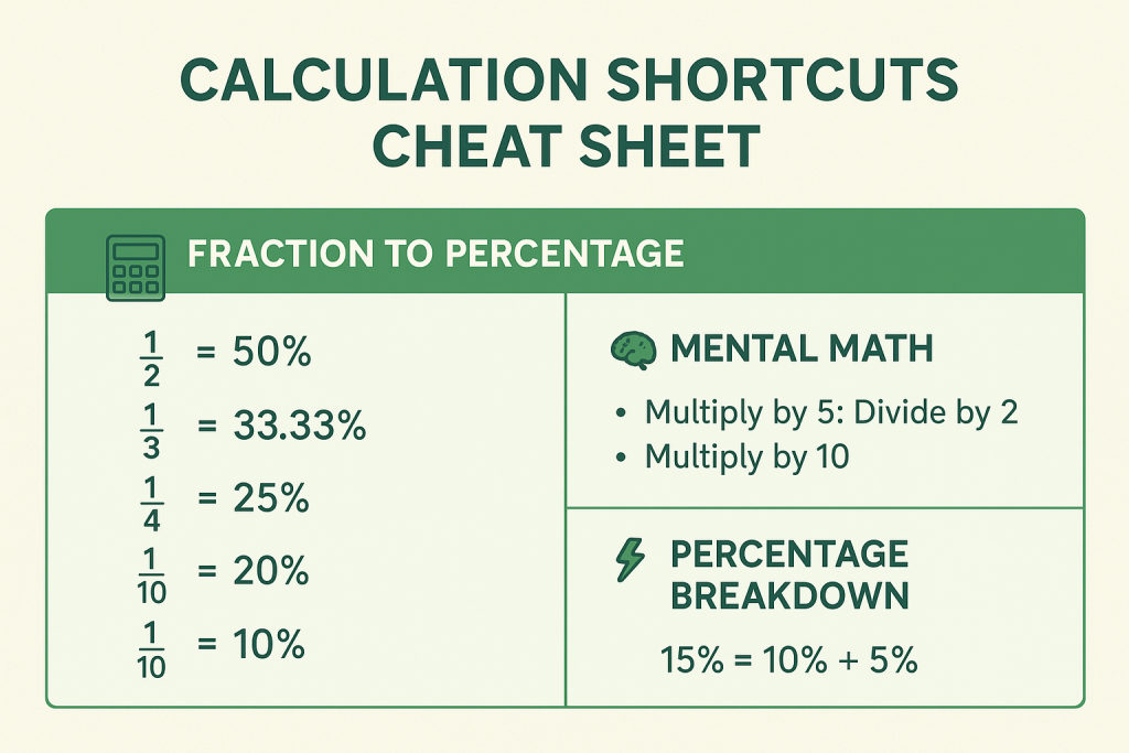
For multiplying by 5, divide by 2 and multiply by 10. So 248 × 5 = 248/2 × 10 = 124 × 10 = 1240. For multiplying by 25, divide by 4 and multiply by 100. Thus 248 × 25 = 248/4 × 100 = 62 × 100 = 6200. These shortcuts appear frequently because percentage calculations often involve multiplying by 5 (for 5%) or 25 (for 25%).
Division Approximation Methods
For division, use factor simplification. To calculate 4800/32, simplify by dividing both by 4: 1200/8 = 150. For divisions that don’t simplify neatly, approximate. If calculating 3847/19, recognize that 3800/20 = 190, so the answer is close to 190 (actual is approximately 202). In UGC NET, where options are typically spread apart, approximations often suffice to identify the correct answer.
Percentage Shortcuts
Percentage calculations consume the most time in DI questions. The shortcuts here can reduce a 30-second calculation to 5 seconds. The key insight is that you don’t need exact answers when options are sufficiently different. Learn to approximate intelligently.
Quick Reference Table Showing Fraction to Percentage Conversion Table
Memorizing common fraction-to-percentage conversions eliminates calculation entirely:
| Fraction | Percentage | Fraction | Percentage |
| 1/2 | 50% | 1/6 | 16.67% |
| 1/3 | 33.33% | 1/7 | 14.29% |
| 2/3 | 66.67% | 1/8 | 12.5% |
| 1/4 | 25% | 1/9 | 11.11% |
| 3/4 | 75% | 1/10 | 10% |
| 1/5 | 20% | 1/11 | 9.09% |
| 2/5 | 40% | 1/12 | 8.33% |
| 3/5 | 60% | 1/20 | 5% |
| 4/5 | 80% | 1/25 | 4% |
When you see 847 out of 2541, recognize that 847/2541 ≈ 1/3 ≈ 33.33%. This instant recognition saves the lengthy division calculation.
Finding Percentages Without Full Calculation
To find 15% of 840, break it down: 10% of 840 = 84, 5% of 840 = 42, so 15% = 84 + 42 = 126. This decomposition works for any percentage. For 37% of 500: 30% = 150, 7% = 35, total = 185. The technique works because 10%, 5%, and 1% are easy to calculate mentally, and any percentage can be built from these.
Reverse Percentage Trick
If a value after 20% increase is 600, what’s the original? Many students incorrectly calculate 600 – 20% of 600 = 480. The correct approach: 600 represents 120% of the original. So original = 600/1.2 = 500. Remember: the increased value represents (100 + increase%) of the original, and the decreased value represents (100 – decrease%) of the original.
Approximation Techniques
Approximation is not about being imprecise. It’s a strategic tool that leverages the multiple-choice format of UGC NET. When options are 23%, 35%, 47%, and 58%, you don’t need to calculate the exact 34.7%. Knowing it’s approximately 35% is sufficient and faster.
When to Round Numbers
Round when the difference won’t affect your answer choice. If calculating 4823/97, round to 4800/100 = 48. The actual answer is 49.7, but if options are 35, 50, 65, and 80, your approximation correctly identifies 50 as the answer. Round aggressively when options are 10+ percentage points apart. Be precise when options are close together (within 5 percentage points).
Using Answer Options to Eliminate Choices
Before calculating, glance at the options. If they are 15%, 30%, 45%, and 60%, and you can quickly estimate the answer is between 25% and 35%, option B (30%) is likely correct. This reverse approach, starting from options rather than from calculation, often saves time. Also, eliminate obviously wrong options first. If total expenditure is 500 lakhs, an option showing 800 lakhs for a component is immediately wrong.
Estimating Before Calculating
Always estimate before detailed calculation. If the question asks for a percentage increase from 340 to 425, quickly note that 425 is about 25% more than 340 (since 340 + 85 = 425, and 85 is roughly 1/4 of 340). Then verify: (425-340)/340 × 100 = 85/340 × 100 = 25%. The estimate confirms your calculation is correct. If your calculation had given 45%, you’d know to recheck because the estimate suggested around 25%.
UGC NET Paper 1 Data Interpretation: How to Solve Table-Based Questions
Tables are the most frequent data format in UGC NET Data Interpretation, appearing in approximately 40-50% of questions based on previous year analysis. A typical table presents numerical data organized in rows and columns, such as company expenditure across different heads over multiple years, or production and export data for various commodities.
We understand that reading this write up might get a bit overwhelming for you especially if you are a fresher, therefore for your easy reference, I am also sharing a link of a YouTube video that serves as an excellent supplementary guide alongside this write-up.
Reading Tables Efficiently
The first 30 seconds you spend on a table question should be dedicated to understanding the table structure, not solving. Many errors occur because students misread which row or column contains the required data. Developing a systematic approach to reading tables prevents these costly mistakes.
Identifying What Each Row and Column Represents
Before attempting any question, identify what the rows represent (typically categories, years, or items) and what the columns represent (typically attributes, values, or time periods). Check the units mentioned in the table header or footnotes. A table showing “Values in Lakhs” means every number should be multiplied by 100,000 for actual value. Missing this detail leads to incorrect answers even with correct calculations.
Spotting Key Data Points Quickly
Scan for maximum and minimum values in each column. Note any obvious patterns like increasing or decreasing trends. Identify totals if provided, or mentally estimate them. This 20-second scan helps you anticipate question types. If you notice one company consistently has higher values, expect a comparison question. If values fluctuate significantly, expect a percentage change question.
Solved Examples with Step-by-Step Approach
Theory without practice is incomplete. The following examples replicate actual UGC NET question patterns. Work through each step to understand the solving methodology, then practice similar questions from previous year papers.
Example 1: Company Expenditure Table
Data: The following table shows the expenditure (in lakhs) of a company under different heads during 2018-2022.
| Year | Salary | Raw Material | Taxes | Fuel & Transport | Miscellaneous |
| 2018 | 288 | 98 | 3.52 | 32 | 72 |
| 2019 | 342 | 112 | 3.68 | 45 | 82 |
| 2020 | 324 | 101 | 3.84 | 41.6 | 74 |
| 2021 | 336 | 133 | 3.92 | 52 | 86 |
| 2022 | 420 | 142 | 4.20 | 72 | 98 |
Question 1: What is the average expenditure on Salary per year during this period?
Solution: Step 1: Add all Salary values: 288 + 342 + 324 + 336 + 420 = 1710 lakhs Step 2: Divide by number of years: 1710/5 = 342 lakhs Answer: 342 lakhs
Question 2: The total expenditure in 2018 was approximately what percent of total expenditure in 2022?
Solution: Step 1: Calculate total for 2018: 288 + 98 + 3.52 + 32 + 72 = 493.52 lakhs Step 2: Calculate total for 2022: 420 + 142 + 4.20 + 72 + 98 = 736.20 lakhs Step 3: Calculate percentage: (493.52/736.20) × 100 ≈ 67% Answer: Approximately 67%
Question 3: What is the ratio of total expenditure on Taxes for all years to total expenditure on Fuel & Transport for all years?
Solution: Step 1: Total Taxes: 3.52 + 3.68 + 3.84 + 3.92 + 4.20 = 19.16 lakhs Step 2: Total Fuel & Transport: 32 + 45 + 41.6 + 52 + 72 = 242.6 lakhs Step 3: Ratio: 19.16 : 242.6 ≈ 1 : 12.66 ≈ 2 : 25 (simplified) Answer: Approximately 2:25 or equivalent
Example 2: Population and Production Data
Data: The table below shows population (in millions) and electrical power production (in GW) for a country over several years.
| Year | Population (million) | Power Production (GW) |
| 1991 | 30 | 50 |
| 2001 | 32 | 80 |
| 2011 | 35 | 100 |
| 2021 | 38 | 140 |
Question 1: What was the power availability per person (in watts) in 2001?
Solution: Step 1: Power production in 2001 = 80 GW = 80,000 million watts Step 2: Population in 2001 = 32 million Step 3: Per person = 80,000/32 = 2,500 watts Answer: 2,500 watts per person
Question 2: By what percentage did power production increase from 1991 to 2021?
Solution: Step 1: Initial value (1991) = 50 GW Step 2: Final value (2021) = 140 GW Step 3: Percentage increase = [(140-50)/50] × 100 = (90/50) × 100 = 180% Answer: 180% increase
How to Solve Pie Chart Questions
Pie charts are the second most common data format in UGC NET Paper 1, appearing in approximately 25-30% of Data Interpretation questions. Unlike tables where data is explicit, pie charts require you to convert percentages or degrees into actual values. This extra step creates opportunities for calculation errors, making a systematic approach essential.
Besides the write up given in the succeeding paragraphs, you can take help of this YouTube video.
Understanding Pie Chart Basics
A pie chart represents the whole as a circle divided into sectors, where each sector’s size corresponds to its proportion of the total. In UGC NET, pie charts typically show percentage distribution of employees across departments, budget allocation, or resource distribution. Your first task with any pie chart is understanding how the division is represented.
Degree vs Percentage Representation
Pie charts use either percentages (where total = 100%) or degrees (where total = 360°). If a sector shows 25%, it represents one-fourth of the total. If it shows 90°, it also represents one-fourth of the total because 90/360 = 1/4 = 25%. Always check how the pie chart is labeled before beginning calculations. Mixing up degrees and percentages is a common error.
Converting Between Degrees and Percentages
To convert degrees to percentage: (Degrees/360) × 100. So 72° = (72/360) × 100 = 20%. To convert percentage to degrees: (Percentage/100) × 360. So 15% = (15/100) × 360 = 54°. Memorizing key conversions helps: 36° = 10%, 72° = 20%, 90° = 25%, 180° = 50%. These conversions allow you to verify your understanding of the chart before attempting calculations.
Pie Chart Calculation Techniques
Once you understand the chart representation, calculations follow standard percentage operations. The techniques below address the most common question types in UGC NET pie chart problems.
Finding Actual Values from Percentages
If a pie chart shows department-wise employee distribution and states total employees = 5000, to find employees in a department showing 18%, calculate: 18% of 5000 = (18/100) × 5000 = 900 employees. This straightforward calculation becomes the basis for most pie chart questions. Always identify the total value first before attempting any calculations.
Comparing Sectors
Comparison questions ask which sector is larger, by how much, or what’s the ratio between sectors. For two sectors showing 35% and 20%, the first is 35/20 = 1.75 times the second, or 75% more than the second. Alternatively, the difference is 35% – 20% = 15 percentage points. Note the distinction: 15 percentage points difference is not the same as 15% more. The latter would be calculated as [(35-20)/20] × 100 = 75% more.
Solved Examples
Example: Employee Distribution Pie Chart
Data: The pie chart below shows the percentage distribution of employees in a company across six departments. Total employees = 4500.
| Department | Percentage |
| HR | 12% |
| Marketing | 22% |
| Finance | 18% |
| IT | 25% |
| Operations | 15% |
| Admin | 8% |
Question 1: How many employees work in the IT department?
Solution: IT percentage = 25% Total employees = 4500 IT employees = 25% of 4500 = (25/100) × 4500 = 1125 Answer: 1125 employees
Question 2: What is the difference between employees in Marketing and Finance?
Solution: Marketing = 22% of 4500 = 990 Finance = 18% of 4500 = 810 Difference = 990 – 810 = 180 Answer: 180 employees
Question 3: Employees in HR and Admin together are what percentage of employees in IT?
Solution: HR + Admin = 12% + 8% = 20% of 4500 = 900 IT = 25% of 4500 = 1125 Percentage = (900/1125) × 100 = 80% Answer: 80%
Example: Budget Allocation Pie Chart
Data: A municipal corporation’s annual budget of Rs. 800 crores is distributed as follows:
| Sector | Allocation |
| Infrastructure | 108° |
| Education | 72° |
| Healthcare | 54° |
| Sanitation | 90° |
| Administration | 36° |
Question 1: What is the budget allocated to Healthcare?
Solution: Step 1: Convert 54° to percentage: (54/360) × 100 = 15% Step 2: Calculate amount: 15% of 800 = 120 croresAnswer: Rs. 120 crores
Question 2: The allocation for Education is what percent more than Administration?
Solution: Education = 72° = 20% of total Administration = 36° = 10% of total Percentage more = [(20-10)/10] × 100 = 100% Answer: 100% more
UGC NET Paper 1 Data Interpretation: How to Solve Bar Chart and Line Graph Questions
While tables and pie charts dominate UGC NET Data Interpretation, bar charts and line graphs do appear, particularly in questions involving trend analysis or year-wise comparisons. These graph types are visually intuitive but require careful reading of scales and axes. This section covers the specific techniques needed for these less frequent but still important question formats.
Bar Chart Questions
Bar charts use rectangular bars to represent values, with bar length proportional to the value. In UGC NET, bar charts typically show sales figures, production data, or enrollment numbers across different categories or time periods.
Reading Single and Grouped Bar Charts
For single bar charts, identify the scale on the y-axis and read each bar’s height carefully. Estimate values when bars fall between gridlines. For grouped bar charts (multiple bars per category), identify the legend showing what each color or pattern represents. Common errors include misreading which bar belongs to which category, especially when charts have many groups.
Comparison and Trend Questions
Bar chart questions typically ask for comparisons: which year had the highest sales, what’s the ratio of sales in year X to year Y, or what’s the percentage increase from one period to another. The calculations are identical to table-based questions; only the data extraction method differs. Spend extra time ensuring you’ve read the correct bar values before calculating.
Line Graph Question Strategies
Line graphs display data points connected by lines, showing trends over time. They’re excellent for visualizing growth patterns, cyclical trends, and comparing multiple data series. In UGC NET, line graphs typically show population growth, temperature changes, or production trends.
Identifying Trends and Patterns
Before answering specific questions, observe the overall trend: is the line generally rising, falling, or fluctuating? Note any peaks (highest points) and troughs (lowest points). Identify if there are multiple lines and what each represents. This initial observation helps you anticipate questions and verify your answers against the visual trend.
Growth Rate from Line Graphs
Growth rate calculations from line graphs follow the standard formula: [(Current Value – Previous Value) / Previous Value] × 100. For average growth rate over multiple periods, calculate individual growth rates and take their average. Note that the average growth rate is different from total growth rate. Total growth from 100 to 150 is 50%, but if this happened over 5 years, the average annual growth is approximately 8.4% (not simply 50%/5 = 10%).
Solved Examples
Example: Year-wise Sales Bar Chart
Data: A company’s sales (in crores) from 2018-2022:
- 2018: 45 crores
- 2019: 52 crores
- 2020: 48 crores
- 2021: 60 crores
- 2022: 75 crores
Question 1: In which year was the growth rate highest compared to the previous year?
Solution: Growth 2018-19: [(52-45)/45] × 100 = 15.56% Growth 2019-20: [(48-52)/52] × 100 = -7.69% (decline) Growth 2020-21: [(60-48)/48] × 100 = 25% Growth 2021-22: [(75-60)/60] × 100 = 25% Answer: 2021 and 2022 (both showed 25% growth)
Question 2: What is the average sales over the five-year period?
Solution: Total = 45 + 52 + 48 + 60 + 75 = 280 crores Average = 280/5 = 56 crores Answer: 56 crores
Example: Monthly Temperature Line Graph
Data: Average monthly temperatures (°C) for a city:
| Month | Temperature |
| Jan | 15 |
| Feb | 18 |
| Mar | 24 |
| Apr | 32 |
| May | 38 |
| Jun | 42 |
Question: What is the percentage increase in temperature from January to June?
Solution: Initial (Jan) = 15°C Final (Jun) = 42°C Percentage increase = [(42-15)/15] × 100 = (27/15) × 100 = 180% Answer: 180% increase
Common Mistakes in Data Interpretation
Even well-prepared candidates lose marks in Data Interpretation due to avoidable errors. These mistakes are often not mathematical but procedural: misreading data, poor time allocation, or answering the wrong question. Understanding common pitfalls helps you develop checking habits that prevent these errors. This section covers the mistakes I’ve observed most frequently in aspirant attempts.
Misreading Units and Scale
The most common error is ignoring or misreading units. A table showing “Production in thousands of tonnes” means a value of 45 represents 45,000 tonnes. Similarly, “Amount in lakhs” means 25 represents 25,00,000. Always check units before calculating. Another related error is misreading graph scales, especially when they don’t start from zero. A bar that appears to be twice as tall might represent only a 20% increase if the y-axis starts from a high base value.
Time Management Mistakes
Time management errors cost more marks than calculation errors in UGC NET. With 50 questions in Paper 1 and 60 minutes, you have roughly 1.2 minutes per question. Data Interpretation questions, with their calculation requirements, can easily consume 3-4 minutes if you’re not careful.
Spending Too Long on One Question
A single difficult DI question is not worth 5 minutes when that time could secure marks in other units. If a question seems complex, make your best estimate, mark it for review, and move on. Return only if you have time remaining. Remember that all questions carry equal marks (2 marks each), regardless of difficulty. An easy Teaching Aptitude question is worth the same as a complex DI calculation.
Not Using Approximation When Appropriate
Many candidates perform exact calculations when approximations would suffice. If options are 23%, 38%, 52%, and 67%, and your rough calculation gives approximately 50%, option C (52%) is clearly correct. You don’t need to verify with precise calculation. Train yourself to check options before calculating. This habit alone can save 3-4 minutes across the DI section.
Interpretation Errors
These errors occur even when calculations are correct. You solve the problem accurately but answer a different question than what was asked.
Answering What Was Not Asked
Read each question twice before solving. “What is the percentage increase?” is different from “What is the increased value?” The first asks for the rate of change, the second for the absolute new value. Similarly, “ratio of A to B” is different from “ratio of B to A” (reciprocals). Underlining key words in the question helps prevent this error.
Ignoring Given Conditions in Questions
Questions often contain specific conditions: “If total employees are 5000” or “Taking 2019 as base year” or “Considering only Department A and B.” Missing these conditions leads to wrong answers despite correct calculations. Make it a habit to identify and note all conditions before beginning your solution.
15-Day Preparation Plan for UGC NET Paper 1 Data Interpretation
A focused 15-day plan is sufficient to take you from beginner level to exam-ready in Data Interpretation. This timeline works whether you’re starting fresh or revising. The plan allocates approximately 2 hours daily, following the same structure recommended by successful UGC NET qualifiers. Consistency matters more than intensity, so stick to the schedule even on days when motivation is low.
Week 1: Learning Foundation and Formulas (Days 1-7)
The first week focuses on building your conceptual base and formula toolkit. You’ll move from basic arithmetic revision to graph-type specific practice.
Days 1-2: Percentage and Ratio Revision
Dedicate these two days to revising percentage calculations, ratio operations, and average formulas. Solve 20-25 basic percentage problems each day, covering percentage of a value, percentage change, and successive percentage change. Use RS Aggarwal’s Quantitative Aptitude or any standard arithmetic book. By the end of Day 2, all formulas from this guide should be memorized and you should be able to apply them without referring to notes.
Days 3-4: Table Questions Practice
Focus exclusively on table-based DI questions. Download UGC NET previous year papers from INFLIBNET and solve all table-based DI sets from 2019-2024. Aim for 3-4 complete sets per day. After solving, analyze your errors. Were they calculation mistakes, misreading errors, or conceptual gaps? Address each error type specifically.
Days 5-6: Pie Chart Practice
Switch focus to pie chart questions. Practice converting between degrees and percentages until it becomes automatic. Solve 3-4 pie chart based question sets from previous years and mock tests. Pay special attention to questions asking for comparisons and ratios between sectors, as these appear most frequently.
Day 7: Bar and Line Graph Practice
Dedicate one day to bar charts and line graphs. Since these appear less frequently, deep practice isn’t required, but familiarity is essential. Solve 2-3 bar chart sets and 2-3 line graph sets. Focus on reading scales correctly and calculating growth rates.
Week 2: Speed Building and Mock Tests (Days 8-15)
Week 2 shifts from learning to performance optimization. Your goal is to solve DI questions quickly and accurately under exam conditions.
Days 8-11: Previous Year Questions (2019-2025)
Solve complete Paper 1 previous year papers, focusing on the DI section under timed conditions. Allocate 10 minutes per DI set (5 questions). If you exceed this time, mark the questions and analyze why you were slow. Was it calculation speed, decision paralysis, or unfamiliar question type? Address the root cause. Download previous year papers from the NTA official website.
Days 12-13: Timed Practice Sets
Attempt mixed DI practice sets with strict timing. Each set of 5 questions should be completed in 8-10 minutes. Use online mock tests from reputable sources or create your own sets from different previous year papers. The goal is building speed while maintaining accuracy. Track your accuracy rate: target is 80%+ (4 out of 5 correct).
Days 14-15: Error Analysis and Formula Revision
Review all mistakes made during the two weeks. Categorize them: calculation errors, conceptual errors, time management issues, or careless mistakes. Create a personal error log and review it before the exam. Revise all formulas and shortcuts. On Day 15, do a final light practice with 2 sets, focusing on confidence building rather than learning new concepts.

Books for Data Interpretation
Quality resources accelerate your preparation. For Data Interpretation, you need practice problems more than theory. The recommendations below are based on what successful candidates have found most useful, combining standard aptitude books with UGC NET specific materials.
RS Aggarwal Quantitative Aptitude (Chapters to Focus)
RS Aggarwal’s Quantitative Aptitude is the gold standard for DI practice. For UGC NET preparation, focus on Tabulation, Bar Graphs, Pie Charts, and Line Graphs. Don’t attempt to solve the entire book; it’s designed for banking exams with higher difficulty. Select moderate-level questions from each chapter.
Trueman’s UGC NET Paper 1
Trueman’s UGC NET Paper 1 is specifically designed for the exam and includes DI practice questions matching the actual difficulty level. The book covers all 10 units of Paper 1 and provides previous year questions with solutions. For DI specifically, it offers approximately 100 practice questions across various graph types. Use this as your primary UGC NET focused resource alongside RS Aggarwal for additional practice.
Online Resources for Data Interpretation
NTA Official Mock Tests website
The NTA official website provides free mock tests that simulate the actual exam interface. These mock tests are invaluable for understanding how DI questions appear on screen, practicing with the timer, and experiencing the computer-based test environment. Attempt at least 3-4 official mock tests in the week before your exam.
Previous Year Papers
Previous year papers from 2019-2024 are essential. Download them from INFLIBNET Answer Key archive or the NTA website. Analyze the DI section of each paper to understand question patterns, difficulty progression, and commonly tested concepts. Your goal is not just to solve these questions but to understand what NTA considers important from the Data Interpretation syllabus.
Conclusion
Data Interpretation need not be the section you fear in UGC NET Paper 1. As this guide has shown, the questions follow predictable patterns, require only basic arithmetic, and can be mastered with focused preparation. The 10 marks from this section are among the easiest to secure once you understand the techniques.
Remember the key principles: tables and pie charts dominate the questions, so prioritize them in practice. Memorize the essential formulas and shortcuts covered here. Use approximation strategically to save time. Most importantly, practice with previous year papers to build familiarity with NTA’s question style.
Your 15-day preparation plan is realistic and proven. Even if you’re starting from scratch with limited math confidence, consistent daily practice of 2 hours will bring you to exam readiness. The no negative marking format means you should attempt all questions, using educated guesses when necessary. With preparation, most candidates can aim for 8-10 marks in this section, providing a solid foundation for clearing the UGC NET cutoff.
FAQs on UGC NET Paper 1
How many questions come from Data Interpretation in UGC NET Paper 1?
Data Interpretation (Unit 7) contributes 5 questions worth 10 marks in UGC NET Paper 1. These questions typically come from one or two data sets, with 2-3 questions per data set based on recent exam patterns from 2019 onwards.
Is Data Interpretation difficult for non-math students?
No, DI is not inherently difficult. It requires only class 10 level arithmetic: percentages, ratios, and averages. The challenge is calculation speed, not mathematical complexity. With 15-20 days of focused practice, even humanities and law students can score 8-10 marks in this section.
Can I skip Data Interpretation and still clear UGC NET?
While technically possible, skipping DI is not advisable. You’d be voluntarily giving up 10 marks. With no negative marking, attempting all DI questions costs nothing. Even random guessing gives you a 25% chance of getting each question right. With basic preparation, you can secure at least 6-8 marks.
What is the best way to improve calculation speed for DI?
Practice mental math daily. Memorize the fraction-to-percentage conversion table. Learn to approximate rather than calculate exact values when options are spread apart. Solve timed practice sets regularly, aiming to complete 5 DI questions in 8-10 minutes.
Which type of graph appears most frequently in UGC NET Paper 1?
Tables are most frequent (40-50% of questions), followed by pie charts (25-30%), bar charts (15-20%), and line graphs (10-15%). Focus your preparation accordingly, dedicating more time to tables and pie charts.
How much time should I spend on each DI question?
Aim for 2 minutes per DI question, totaling 10 minutes for the complete DI section. This leaves adequate time for other Paper 1 units. If a question is taking more than 3 minutes, make your best guess and move on.
Are calculators allowed for UGC NET Paper 1 Data Interpretation questions?
No, calculators are not allowed in UGC NET. All calculations must be done mentally or using rough sheets provided at the exam center. This is why learning mental math shortcuts and approximation techniques is essential.
What formulas should I memorize for Data Interpretation?
Essential formulas include: percentage calculation, percentage change, successive percentage change, ratio-to-percentage conversion, simple average, weighted average, and growth rate. The complete list with examples is provided in the formulas section of this guide.
How do I practice Data Interpretation effectively?
Start with topic-wise practice (tables, then pie charts, then bar/line graphs). Solve previous year papers from 2019-2024. Practice under timed conditions. After each session, analyze your errors and address weak areas specifically. Use RS Aggarwal for additional practice problems.
Is 15 days enough to prepare for UGC NET Paper 1 Data Interpretation from scratch?
Yes, 15 days with 2 hours daily practice is sufficient for most candidates. The first week focuses on building formula knowledge and graph-type specific practice. The second week emphasizes speed building through timed practice and previous year papers.
Should I attempt all Data Interpretation questions even if unsure?
Absolutely yes. UGC NET has no negative marking, so every question should be attempted. Even if you’re completely unsure, eliminate obviously wrong options and make an educated guess. A 25-50% chance of getting marks is better than a guaranteed zero.
Related Reading: UGC NET 2025: Is It Online or Offline? CBT Mode Essentials: https://blog.ipleaders.in/ugc-net-exam-is-it-online-or-offline/, Research Aptitude for UGC NET Paper 1: Essential Concepts Simplified (Unit 2): https://blog.ipleaders.in/research-aptitude-for-ugc-net-paper-1-unit-2/, Teaching Aptitude for UGC NET Paper 1: Essential Guide for Unit 1 Preparation:


 Allow notifications